



EVO oil for Parco delle Lamie.
Details make the difference in our work. They’re what make a label much more than a piece of paper, transforming it into a veritable garment that dresses the product and allows it to tell its story.
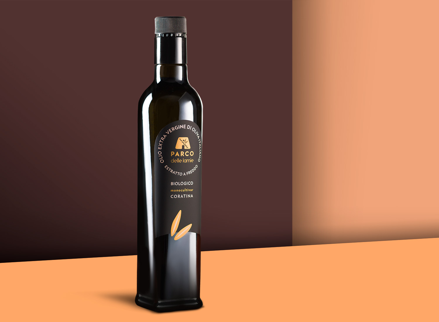
The die designed for the “Parco delle Lamie” organic monocultivar Coratina olive oil embraces and resonates with the logo’s shapes, seeking an ideal combination of sobriety and creative flair. The two golden leaves that stand out against the black of the lower part of the backing, protruding from the label and invading the dark color of the glass with their simple and elegant lines, are the element that breaks the mold, but not the compositional harmony.
The chosen paper is Matt Silver by Manter by Fedrigoni, screen-printed with glossy rubberized details.
Read recent articles
Rohesia is renewed
SwissCells and Label Design, Italian design to communicate the excellence of nutritional support “made in Switzerland”.
Bellamarina Estates Galè
Lady for Tenuta Liliana